
Telus Bubble was a 24-hour hackathon project completed in collaboration with Telus Digital. Our cross-functional team, consisting of three web developers and two UX designers, came together to tackle a key challenge in digital entertainment: helping users navigate the overwhelming amount of content and streaming options available today.
In this case study, I outline how we approached the challenge through rapid user research, agile design methods, and deep cross-team collaboration, ultimately producing a mobile-first prototype designed specifically for younger audiences.
The Challenge
Telus posed a clear question: "With the rising number of streaming services, how should Telus package its offerings to best serve users?"
Today's consumers often experience option paralysis due to the vast amount of available content. We needed to create a simple, intuitive solution that helped users easily find and manage content they loved. The goal was to position Telus as a flexible, appealing content provider, particularly among younger users less interested in traditional TV packages.
Research & Discovery
Given our tight timeline, we quickly conducted focused research to gain insights into Telus' customers and broader industry trends.
Demographic Insights
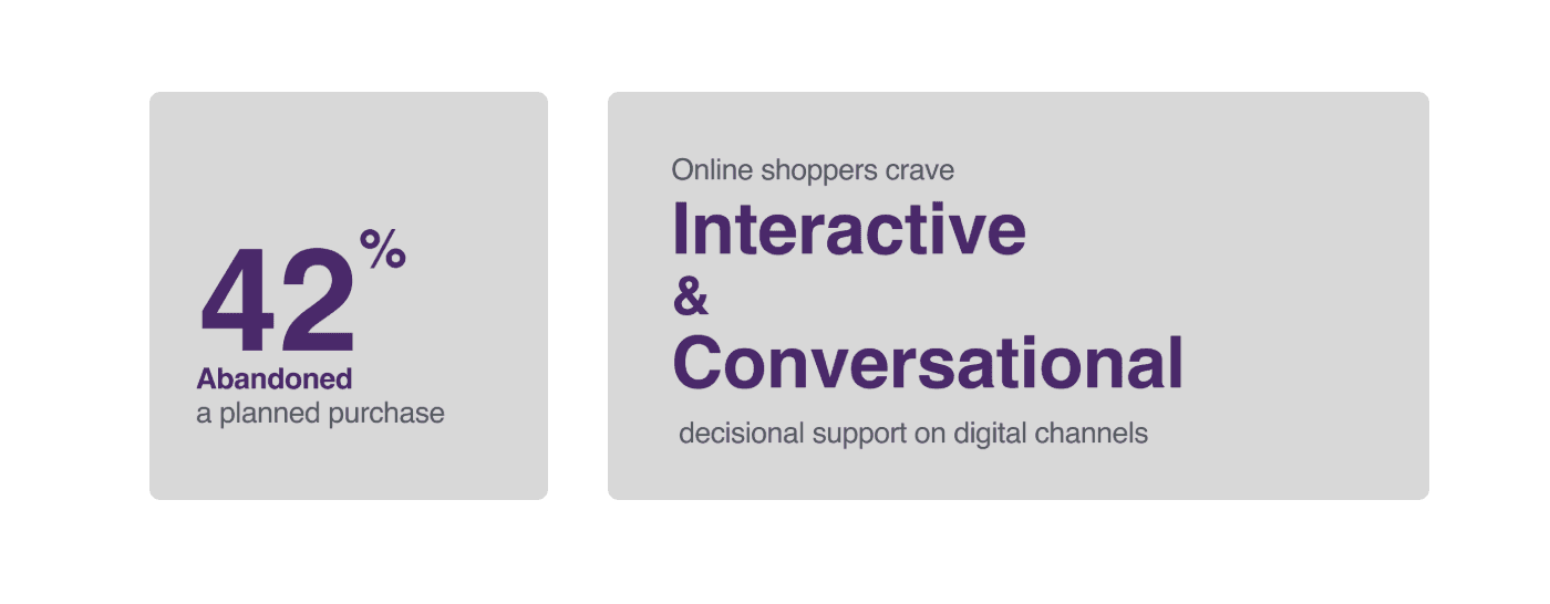
A 2021 survey highlighted that only 34% of adults aged 18–29 still subscribed to traditional cable or satellite TV, compared to 56% overall. Clearly, younger audiences were shifting towards mobile-first streaming services.
Streaming Trends
Data showed a steady decline in Canadian pay-TV subscriptions, reinforcing the preference for flexible streaming solutions.
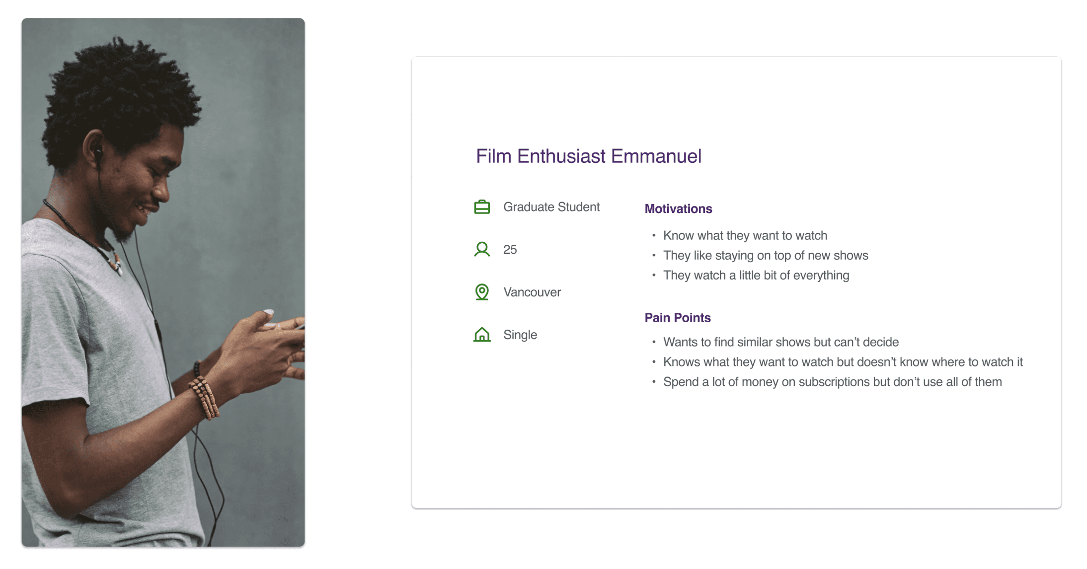
We created a proto-persona named Emmanuel: a mid-20s film enthusiast frustrated by complicated subscription processes and excessive channel choices. His persona helped clarify user needs and identify friction points in Telus' existing services.
Design Goal
Our main objective became clear: "How might we engage millennials and Gen Z, encouraging them to choose Telus as their preferred content provider?"
We aimed to:
Create a mobile-first experience.
Enable personalised content bundles.
Reduce choice fatigue through clear, relevant content recommendations.
Constraints & Assumptions
We couldn't alter pricing for existing Telus plans.
The solution had to prioritise mobile use.
We assumed users valued personalised content and maximum value.
UX Process & Approach
User Needs & Stories
Using quick persona mapping and journey walkthroughs, we defined clear user goals such as customising content, managing subscriptions from mobile devices, reducing unnecessary costs, and discovering new shows easily. These user stories formed the backbone of our design decisions.

Ideation & Collaboration
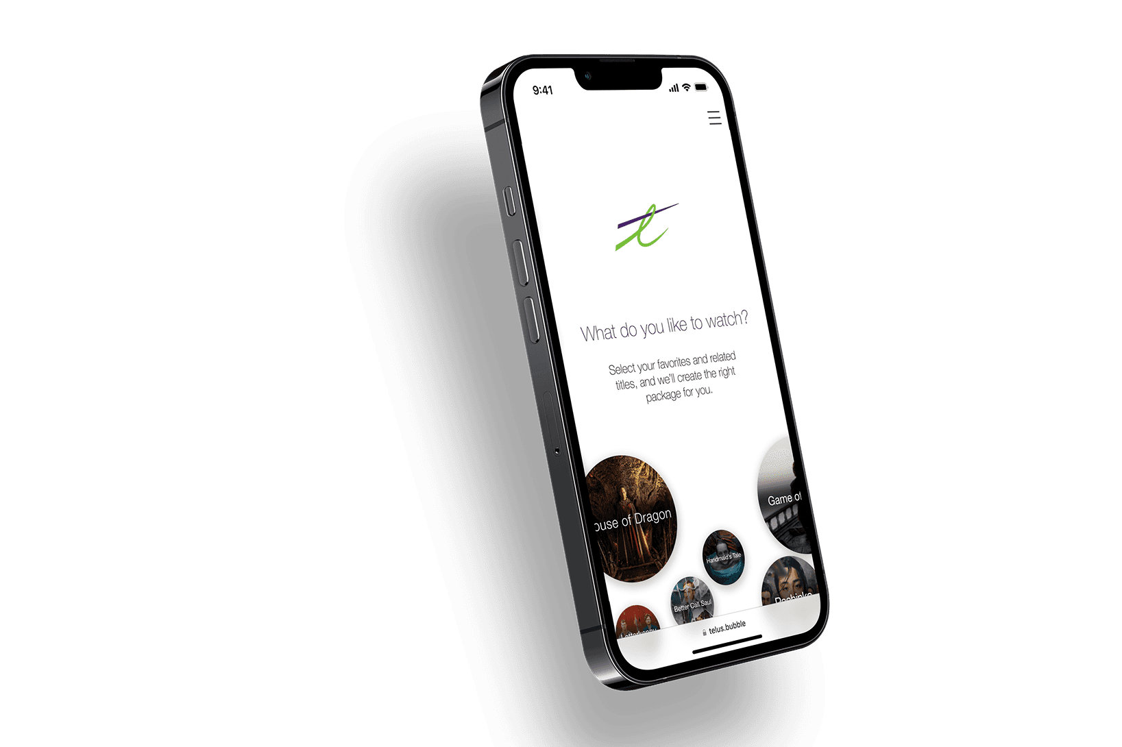
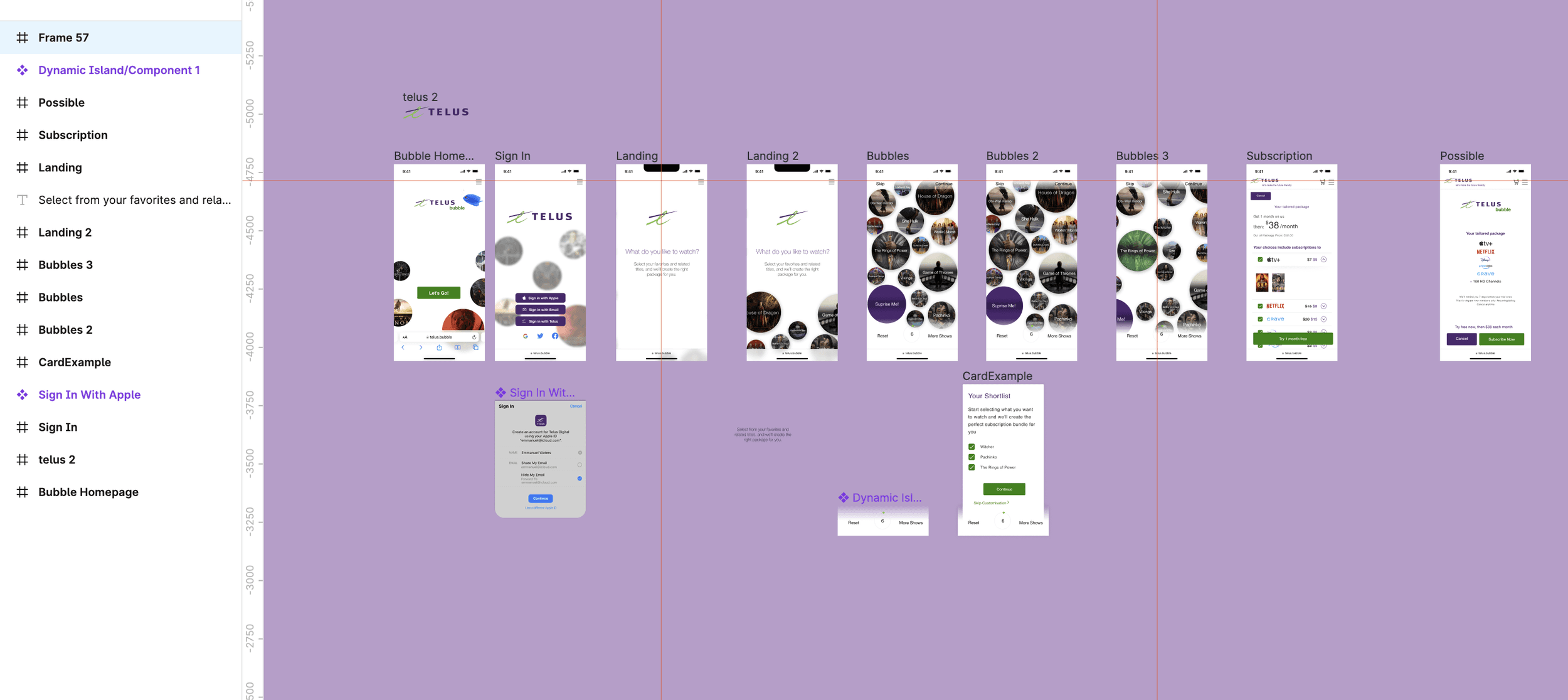
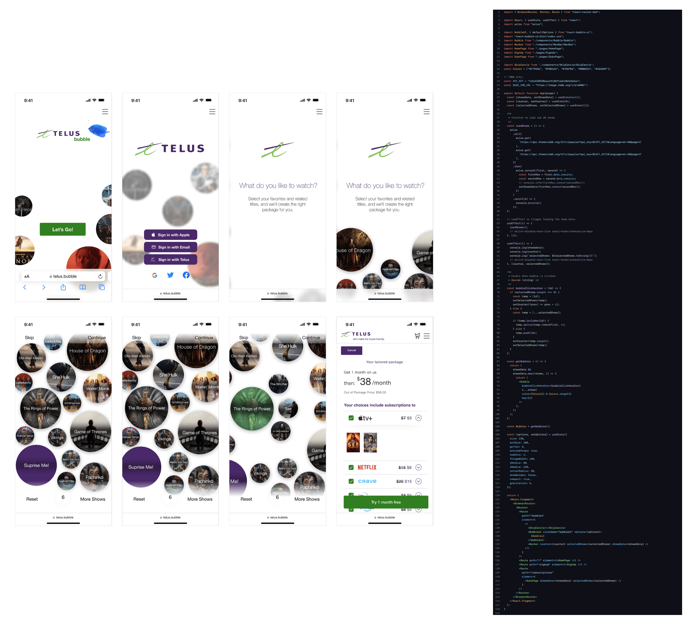
Our ideation was highly collaborative, with designers and developers working together closely throughout the process. Given the strict 24-hour timeframe, we prioritised speed and direct collaboration, skipping traditional greyscale wireframes in favour of jumping straight to high-fidelity Figma prototypes. Each completed design component was immediately shared with developers, enabling rapid iteration and continuous alignment.
Prototyping & Iteration
We quickly translated user stories into a clear and straightforward user flow that minimised complexity and kept interactions intuitive. This iterative approach helped us identify and refine key interactions rapidly, maintaining momentum and quality despite time constraints.


Implementation & MVP
By the end of the hackathon, we delivered a polished and functional prototype that allowed users to:
Select content based on personal preferences.
Preview bundle contents easily.
Manage their choices from an intuitive mobile interface.
The final prototype closely matched our initial vision, demonstrating the effectiveness of continuous communication and collaboration between designers and developers.
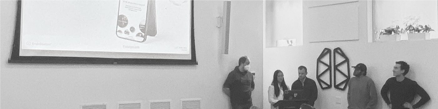
Presentation & Reception
I presented our prototype to Telus stakeholders, showcasing the interactive features and user flows. Feedback was highly positive, particularly highlighting the "bubble" interaction that allowed users to choose and prioritise content into custom bundles. Judges commended our attention to detail, design simplicity, and effective scope management.
Key Learnings
User-Centric Under Pressure
Even with a tight timeline, prioritising user needs ensured our solution remained focused and impactful.
Collaboration Improves Quality
Continuous communication between design and development teams significantly enhanced our prototype’s quality and feasibility.
Simplicity Enhances Experience
Reducing complexity created a superior user experience, particularly valuable for younger, mobile-first audiences overwhelmed by choice.
Bold Iteration Drives Results
Rapid iteration and decisive action allowed us to deliver meaningful results within a very short timeframe.
Final Thoughts
Participating in the Telus hackathon was intense yet incredibly rewarding. It emphasised the power of agile design methods, strong teamwork, and keeping users at the centre of every decision. Despite significant time pressures, we created a thoughtful, engaging solution that addressed real user challenges effectively.